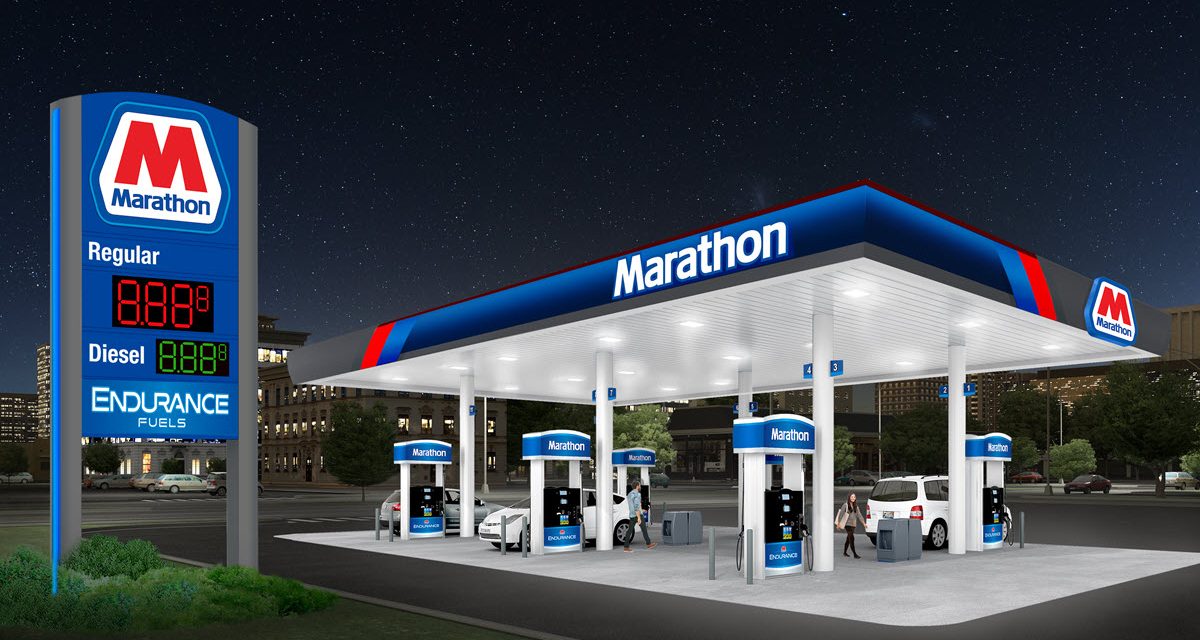
Marathon Petroleum Corporation revealed a new image for Marathon branded gas stations to represent the retail brand into the next decade and beyond.
“Remaining true to our heritage, you will still see the familiar red, white and blue colors reconfigured into a bolder, more contemporary design,” said John Rice, manager, Brand Marketing at Marathon. “Updated dimensional elements such as a retooled logo, channel letters and illumination will capture attention both day and night. The new image also features ‘Endurance Fuels’ to underscore Marathon’s enduring commitment to provide consumers with high-quality fuels.”
As part of the development process, Marathon will test the new look this month at three prototype sites in Findlay, Ohio – home of the company’s headquarters – and will announce a full launch plan by August.
Steve Solomon, director of Brand Strategy and Innovation at Marathon, said the new image provides a brighter, more modern look that emphasizes Marathon’s commitment to quality and reliability with space for further innovations. “Brand marketing is a key component of Marathon’s go-to-market strategy, and this new image is just the beginning of more innovations to come,” he said.